 |
Marie Claire.
|
 |
Marie Claire.
|
 |
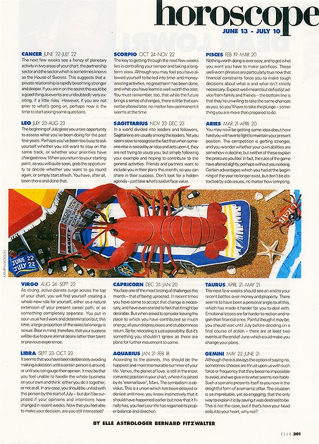
| Elle. |
These are a few horoscope articles that I have found whilst doing some research. I've found that whilst looking at horoscope pages within magazines there are a very, very small amount that I find visually interesting. The top two that I found are from Marie Claire Magazine Spain, I like the layout of the article itself since it's clear and easy to read plus the star sign of the month is highlighted in a different colour which I think works well. In regards to the imagery used I do like it but to an extent. The colours and the drawings themselves I think are beautiful and highlight the corresponding star sign effectively but personally I find them too stereotypical i.e. you know that the pisces sign is a fish and so a drawing of fish is used. The same can be said from the third article from Elle Magazine, the image creates a relaxing/holiday atmosphere, somewhere which horoscopes are always read, but I don't think it relates to star signs at all. These type of images are what make me want to create work that is visually exciting as well as something that isn't necessarily viewed as the "typical" horoscope illustrations used today.


No comments:
Post a Comment