Thursday 31 October 2013

ANNIKA WESTER.

Nordiska Kompaniet guidebooks for Stockholm & Gothenburg. 
Vogue Girl. 
Illustrations for FANCL Cosmetics. 

Since I'm still looking into artists which have created illustrations for horoscopes I came across Annika Wester. Her illustrations are extremely delicate and girly and they work really well with her choice of colour palette, which mainly consists of pastels. 

I'd noticed that she created a set of star signs for Vogue Girl which are very sweet and work well for Vogue Girl since it is aimed at the younger woman. But again they are very basic in style and I feel like maybe not much effort had gone into them. This is exactly what I'm trying to change about the horoscope section. Why shouldn't they be just as visually interesting and beautiful as the rest of the images and articles used? I want mine to reflect the beauty of the rest of the magazine, not just use any old thing which resembles an animal and hope that will be enough. I'd ideally like my work to be something that makes people view the horoscope illustrations as something pleasing and fresh to the eye. 

EXPERIMENTATION - LEO.


I wanted my Leo woman to look very refined and poised, the photograph I found captures this perfectly and I feel like she even slightly resembles a lioness. Again keeping with the idea of 'star sign goddesses' I gave her a halo, although this was created by layering lots of the same image/shape but moving them around slightly so the pattern has a 'lived-in' quality. I wasn't quite sure where to place the images of the lions and whether 1 or 2 looked better. I played around with this for so long and finally decided that they looked best placed underneath her shoulders, similar to the Scorpio image, following the line of her shoulders and I like how they seem to be part of her outfit. 

I really like this image since I feel it really embodies the 'confidence' and 'king of the jungle' qualities that are related to Leo's. However, this is still just the beginning and in no way feel that it's a finalised image, so I'm excited to see how I can push this further. 


EXPERIMENTATION - SCORPIO.


I'm working on this in response to the Scorpio star sign. The two words that had stuck out for me for it's description were 'confidence' and 'jealousy' so chose to base it around those. This isn't finished or refined at all but I want to keep sharing the progress of my work, even if they aren't 'done' as such. 

I've been keeping the background the same for each image, as well as the constellations that I use, are the same for each sign but they differ in placement and size. This is so that all the images will look uniform once all placed on the horoscope page, with small links as such, but will obviously be different in terms of the star sign and images used. 

I experimented with layering text and images onto the figure more with this one in comparison to the Taurus picture. I made the constellations round and placed them behind her head to represent the night sky and to also resemble a halo,  I like the idea of making them look like star sign goddesses. I like the placement of the text since it follows the shape of the top of her shoulder but I kept it see-through so the rest of her was still visible. This the same for the opposite shoulder, I kept it more abstract so that it was more of a block shape, although still maintained within the figure. It slightly shows a drawing of a scorpion, although it's not very clear so I'd like to go back and see if there's a different way for me to show this. 

JENNY BOWERS.


I came across Jenny Bowers work and was extremely intrigued by her use of colour, text and image. Her designs are simple, bold and colourful, with a childlike quality to them.  I love her layering of colour and text on top of each other, as seen in the first and last two images, it creates lovely depth and maybe this is something that I can apply to my own work. I mainly use photographs for my collages but I'd like to see if creating some coloured backgrounds or text with other media to scan in and use would be beneficial to my work. 

EXPERIMENTATION - TAURUS.


This is a quick digital collage I created for the star sign Taurus. I've always enjoyed working with fashion images/photography and I feel I produce the best work this way. I'd mentioned in my previous reflection that instead of illustrating the text from horoscopes I wanted to do the star signs themselves. To make this more interesting I've been looking into the various descriptions for each star sign in terms of traits a person might have or qualities of their personality. This will act like a 'mini brief' for each sign so that I have something to work from. The reason I didn't want to illustrate the text is because I wanted to try something that hasn't been done before but to also keep the images connected with the 'true' meaning. 

I want each image to reflect the star sign but it's theme will link to a particular aspect of their description. One of the words that had stuck out in regards to Taurus was 'sensuous' so I decided to take this as the theme to base it on. The photographs are a variety of scans from magazines and some that I have in my own collection of images. I wanted this to look romantic and I feel like I managed to achieve this quite well with the particular images that I chose. Pinks and reds are usually connected with love and romance hence the use of the pink flower, I also wanted the women to have red hair too to maintain the colour associations people have with the word 'sensuous' . I felt like the woman should have been coming out of the flower, like an explosion of love and lust. This is furthermore shown with the male hands coming out through the flower, holding onto the woman's breasts. The placement of the bulls horns behind the woman's head show that this is the Taurus star sign but keep it subtle and not as in-your-face as a lot of today's horoscope illustrations. 

This is still very much a working progress so the images I'll be sharing are starting points to then refine and change into finals. 

Monday 28 October 2013

REFLECTION - 28.10.2013.

I've been thinking a lot about what aspect of the horoscopes I wanted to illustrate, the star signs themselves or the writings? And I've come to the conclusion that I shall focus on the star signs individually rather than the text, since that might make them too complicated and busy for a magazine layout, so by keeping it just to the star signs they are clear and straight to the point. 

I have also had a hard time trying to make my collages by hand since I felt like it wasn't working very well for this particular idea. My images just weren't coming out as I had planed them too so I decided to make the decision of using the computer to make them digitally. I used digital collage for my project last year and really enjoyed working with it since it allows me to create images quickly but also really play around with scale and composition, something that I want to keep pushing. I still love hand rendered collage but I've also found that I'm a lot happier working with digital means when my time schedule is very short and I find that I can generate ideas more easily without the stress of staring at cut up bits of paper. I feel like this is the right route for me to go down with in regards to my work for BA7.  

CONSTELLATIONS.

Busch, Georg: Die andere beschreibung von dem cometen/... 1572. Erfurt, Germany, (1573).
John Flamsteed: Atlas Coelestis, London, (1781).
Anonymous old German manuscript: (circa1450).
Theodorus Maius: Kurtzer bericht von dem Strobelstern Oder Cometen Magdeburg, (1607).

I've been looking into old drawings of constellations and came across some interesting images. A lot of them consisted of drawings of the gods or star signs which then had the mathematical diagrams of the night sky mapped out over them. I'd like to apply this to my own work and consider mixing together old drawings and maps alongside current images. This will be a good way to combine the old, magical side of star signs but keeping it up to date with modern photography that will still appeal to fashion magazines. 

Wednesday 23 October 2013

VISIONAIRE.


In my review yesterday someone mentioned to look at Visionaire Magazine and I'm so grateful! It is a an album that covers fashion, photography and art produced in a number of limited editions. It's devoted to visual expression has a huge catalogue of contributors from Tim Burton, Mario Testino, Louis Vuitton, Sarah Lucas and hundreds more. Each issue has a different theme and format which the chosen artists can produce their own interpretation of it. 

They had many issues that covered themes such as fantasy, religion and heaven. The imagery created for each issue is beautiful and they all have a mythical air to them which I felt linked in well with star signs, even if that wasn't the theme. It's given me a lot of ideas in terms of how I can push my work so that it's as visually rich and otherworldly as possible. 

REFLECTION - 23.10.2013.

Yesterday we had our first group tutorial with Chris which went really well! I usually feel like I get more negative criticism from group tutorials, rather than constructive, but everyone had made some very useful points that have given me a lot to think about in regards to my work.  

It was really nice to speak to everyone about what I've been looking into and how I'd like to apply it to publications. I feel a lot more level headed about what I'm doing and what else I can explore to expand my ideas. I thought that I would write down the main points that I thought were helpful and will help my work progress forward: 

  • Push interpretation of the images - don't feel you should conform to what is 'out' there.
  • Magical = good. 
  • Will it be all 12 signs or a selection. 
  • If someone is going to have a bad day will it affect the illustration?
  • Will they be of the sign or what is predicted?
  • Graphs/ charts/ mathematical drawings? 
  • Digital experimentation? 
  • Historical superstition, myths and beliefs. 
  • Compare and contrast your work to other work in the field - will show development, understanding and problem solving skills. 
  • Powerful but simple shapes and images?


PIERRE ET GILES.


I came across these images by French artists Pierre et Giles and thought they linked in well with the idea of star signs. Their work is influenced by art history, popular culture, religion and lots more. They create all of theirs sets and costumes, take the photographs and then hand paint them with acrylic paints. I've never seen anything like this before and what drew me to their work was the ethereal, magical feel of their images. I'd like my collages to have a heavy, rich look to them but still maintaining the mystical side to them. 

Tuesday 22 October 2013

ILLUSTRATED APE MAGAZINE.


Trina Dalziel. 
Selina Cassidy. 
Julie Verhoeven. 

These are some images from The Illustrated Ape magazine which Glynn had mentioned to look at yesterday. I couldn't find too many images of the actual page spreads but maybe the library has the magazine in their archives so the ones shown I picked due to their layout and colour. 

I think the layout of a magazine spread or page is so important as an illustrator since you have to make sure that everything is balanced, your illustrations need to compliment the writing but also make sure that they aren't taking up too much or too little space. I thought I'd write some quick and short points to highlight what I like about each image: 

Trina Dalziel: 
  • I like the limited use of colour palette by only using white, black and red. Gives the page a strong and loud voice. 
  • I've never seen a concertina style layout before and it connects her images like a story. It's also aesthetically interesting since it gives it a slight 3 dimensional feel, as if its coming out from the page. 
  • I also liked the mixture of drawings styles since they seem to bounce off each other well. 
Selina Cassidy

  • This was my favourite layout from all the images. I like her use of space around the text by keeping her images in the corners of the pages. 
  • Again the mixture of medias work well since they compliment each other through her choice of colours. 
  •  The tidy, uniform look of the text keeps it from becoming overwhelming since there is quite a bit of writing, this could have taken away from the illustrations but instead keeps the balance. 
Julie Verhoeven

  • Use of one side of the spread for her image makes it more dramatic.
  • I like the mix of fine lines, block colour and brush strokes. 
  • the text is almost the same length of the illustration and I like the contrast of the two next to each other. 

ROOKIE MAGAZINE.


Beth Hoeckel.
Monica Ramos. 
Beth Hoeckel. 
Emma Dajska. 

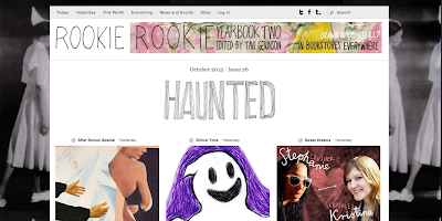
Rookie Magazine is an online publication written by girls, for girls. It's audience is mainly teenagers but I read it religiously since the articles are so well written that I think it can be enjoyed by girls any age. They have monthly "issues" which have their own theme and include writings, photography, DIYs, illustrations and videos. I've always loved their magazine due to the variety of artists that they get involved and a few that I'd researched previously have contributed to Rookie Magazine already such as Monica Ramos and Beth Hoeckel. 

They don't have a horoscope section but they have had articles in regards to astrology and star signs. I feel like this might be the right publication for my work to be used for since they use a lot of different illustrations whether its paintings, photography or collage. I want my work to have a magical maybe even slightly dark feel to it and Rookie Magazine seems to be the perfect platform for this. Even though they don't have horoscopes this could be a way for me to make my own or even write a small star sign article to illustrate for them. Obviously I'll have a better understanding of whether my work will fit into Rookie once I start making my collages but I feel like this is a good magazine to keep in mind. 

REFLECTION - 22.10.2013.

It's been a while since my last reflection so thought I'd type one up now since I'm on a roll. I began looking at lots of different magazine articles to see what they had to offer when it came to the horoscopes section, I've viewed pages from Vogue, Vogue Girl, Harper's Bazaar and Marie Claire. 

So far it hasn't all been that great but thats also the good part since it makes me want to create better and more visually exciting work! I had a brief chat with Glynn yesterday about what I was looking into and he mentioned some good points: 

  • Try looking at how the artists apply their work to other publications, is it any different? 
  • Finding alternative horoscope pages - The Illustrated Ape, The Face. 
  • Look at horoscopes in The Guardian and The Telegraph. 
  • Looking at various layouts. 

These have given me some food for thought and definitely sparked ideas in terms of which publication I would apply my work to. I want to look at how the horoscope pages look within newspapers and also more individual magazines that might have their own horoscopes written up. 

HOROSCOPE RESEARCH - HARPER'S BAZAAR MAGAZINE.


I looked online to see what the horoscope pages looked like on the magazines websites and came across these from Harper's Bazaar. I think these are so boring and poorly drawn! To me they look like initial sketches of what they'd wanted their designs to look like. I don't mind the layout but then again thats probably up to the website designers. I feel like these could have been so much more fun and adventurous but they settled with whatever went with each sign. 

SALVADOR DALÍ - TAROT CRADS.


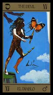
These are some Tarot cards which Salvador Dalí created. He made 22 Major Arcana and 56 Minor Arcana all through painting and collage. I thought these were a great way to see a mixture of medias being used together. I particularly like the second one down, La Muerte, which represents death but it's Dalí's surrealism that has made me consider that my work doesn't have to be straight forward and obvious. Star signs are still something that retain that mystical history behind them and surrealism feels like an appropriate way to show that. 

Monday 21 October 2013

ZODIAC FIGURES.


TAROT CARDS.


Since I'm looking back into the history of zodiacs and start signs I thought it would be good to look into Tarot cards as well since it's a subject that I've always been fascinated by and it also links in with horoscopes. Every star sign is linked with a Tarot card from the Major Arcana. Nearly all Tarot cards are represented by very celestial, sometimes macabre, figures that represent the essence of a person. 

The particular cards that I have posted are from an ancient Italian Tarot card deck created by engraver Carlo Dellarocca. What drew me to the imagery was the fine detail reflecting that of the engraved original. The colours are rich and I like the old type used for each cards title. This style of imagery is something that I would like to include within my collages so I'd like to try and find some books on Tarot cards! 

ANCIENT ZODIACS.

11th Century zodiac. 

Indian zodiac. 

These are a few ancient zodiac signs that I wanted to quickly post up before I forgot them completely. I like how a lot of the imagery from back then was very simple and this idea can be applied to my own work. They were all set out in this round, circular grid formation and this might be a layout worth exploring with my illustrations, even if I see them as being individual representations of the star sign. 

HISTORY OF THE ZODIAC.


I've been reading into the history of zodiacs and star signs and found this article written by Kristin O'Donnell Tubb. I've taken the main points that I found interesting and that I think would be good to refer to:

  • Astrology is the theory that the position of the stars and planets has an affect on our daily lives. Because of that, our birthdate determines quite a bit of our personality. Because of that, the waltz these celestial bodies dance across the heavens provides us with both opportunities and obstacles.
  • Most folks who know about these things agree that the Babylonians were the first to develop this idea, some say as far back as 2500 B.C. Like most humans, they were likely trying to make sense of the world around them, to find order in the chaos. Like most humans, they looked up to do that.
  • The idea took. The Babylonian zodiac calendar, which originally had 13+ horoscopes signs (see below), seeped into other cultures. Egyptians adopted the idea. Egyptian decans were star clocks of sorts, depicting 36 constellations that rose and fell, each marking a new phase. Decans were associated with diseases and healings, and each new phase held positives and negatives for health. They have been traced as far back as 2100 B.C., appearing on coffins from around that time. 
  • Indian cultures welcomed these theories, too. Hindu nakshatras divide the ecliptic into 27 or 28 sectors. Each sector is governed by a lord who is fated with forecasting the life path of individuals within that sector. Hindu astrologers believe that children should be given names that please their nakshatra. These calendars started appearing around the beginning of the last millennium B.C. The Chinese zodiac is based on the lunar calendar and appoints one of twelve animals to guide the children of that year. Pottery crafted in China depicts the Chinese zodiac as early as 475 B.C.