Tuesday 26 November 2013

LAYOUT DEVELOPMENT - 26.11.2013.


Today I made some layouts with the new images that I had made yesterday! It worked out really well and I think they work well with the rest of the text. I also managed to print out lots of work to put into my development folder and portfolio too. I did start to make new layouts for these images by using the collage text I had previously used for initial layout ideas. This is because I still really like the contrast between the 'cut outs' and the cleanness of my image and I just want to see if it works better than this! I will post up photos as soon as they are finished.  

DEVELOPMENT CONTINUED - 26.11.2013.


These are a few more images that I made this morning. I'm really happy with the way these are turning out considering I have 2 days left till my hand in. I think that the first and third images work better than the second since they look more tropical than than the second. I don't like how I have overlaid the palm tree over her face, it doesn't look as good as it did on Photoshop! The reds, oranges and pinks that come through on the first and second images resemble the way people look on the screen when using heat detectors so that ties in well with the ''holiday'' text for Taurus. I'm going to see what these look like printed out, along with the others I uploaded yesterday. Then I'll apply my favourites to the magazine layout I created to see what looks best. 

Monday 25 November 2013

TAURUS DEVELOPMENT - 25.11.2013.


Moving on from what Chris had spoken to me about in the crit, here are some development images! I read through the horoscope text and decided to go for Taurus. This was because it spoke about going away, making trips, taking a break so it all related to holidays which I thought would be a fun way to include that in the imagery. 

We have also touched upon the subject of copyright a few times and I already know what the rules are when it comes to using other peoples images. Since I'm not selling my work then I don't have to worry but because I am developing this image I chose to work with photographs that my friend Charlotte took. Having spoke to her earlier in the month I already have her permission to use them so that was extremely helpful! As you can see I've made quite a few so far and I will have to narrow these down and then develop those down to finals tomorrow. 

REFLECTION - 25.11.2013.

I spent the morning sorting out my booklet, which I then managed to print out (finally). I'm happy with the way it came out besides the fact that it was just on normal printer paper, nothing special yet. It's slightly smaller than A5 I think but it could do with being reduced in size actually since I feel that my images look better small. 


Today was also crit day with Chris which I was really looking forward to. I've been feeling slightly stuck with my images and I think a lot of that is due to the fact that I've had to create 12 different images. It's meant that due to the short amount of time we've had on this project my initial images had to then become my finals, so I've felt that I haven't been able to develop them as much as I've wanted to. After speaking to Chris about this and showing him my work so far he suggested that I choose 1 or 2 images to then develop further and doing this by relating the images a lot more with the given text. I really liked this since I'd been mainly focusing on linking the images in with their specific descriptions and personas as such. You never see the imagery within horoscopes actually reflecting what the text is saying so this left me feeling positive about what to do next. Chris also mentioned that I should play around with where I place my imagery on the page, don't default to just the middle, and also to play with the scale. I really enjoyed the crit and felt that I managed to get all my thoughts out as well as receive great constructive criticism. 

I also made the decision to purchase an A4 sized portfolio since my work will, and usually is, to that size. It just made sense to buy one that would compliment and present my work well, rather than my chunky old one from previous years. 

Sunday 24 November 2013

REFLECTION - 24.11.2013.

It's now only one week till the deadline on the 29th and so I thought that I should write up the last things that need to get done before then. Friday was a very productive day but then it went all wrong when the systems had gone down at uni! It was so frustrating since I couldn't get my booklet printed due to my USB being completely full and I couldn't access my folder from anywhere else. But I bought a new external hard drive so I am all ready tomorrow to attack the printers! So with that in mind this is what needs to be done: 

- Print out booklet
- Print out blog posts e.g. reflections & organise in folder
- Correct spelling on magazine layout. 
- Photocopy pages from collage books/organise/highlight 
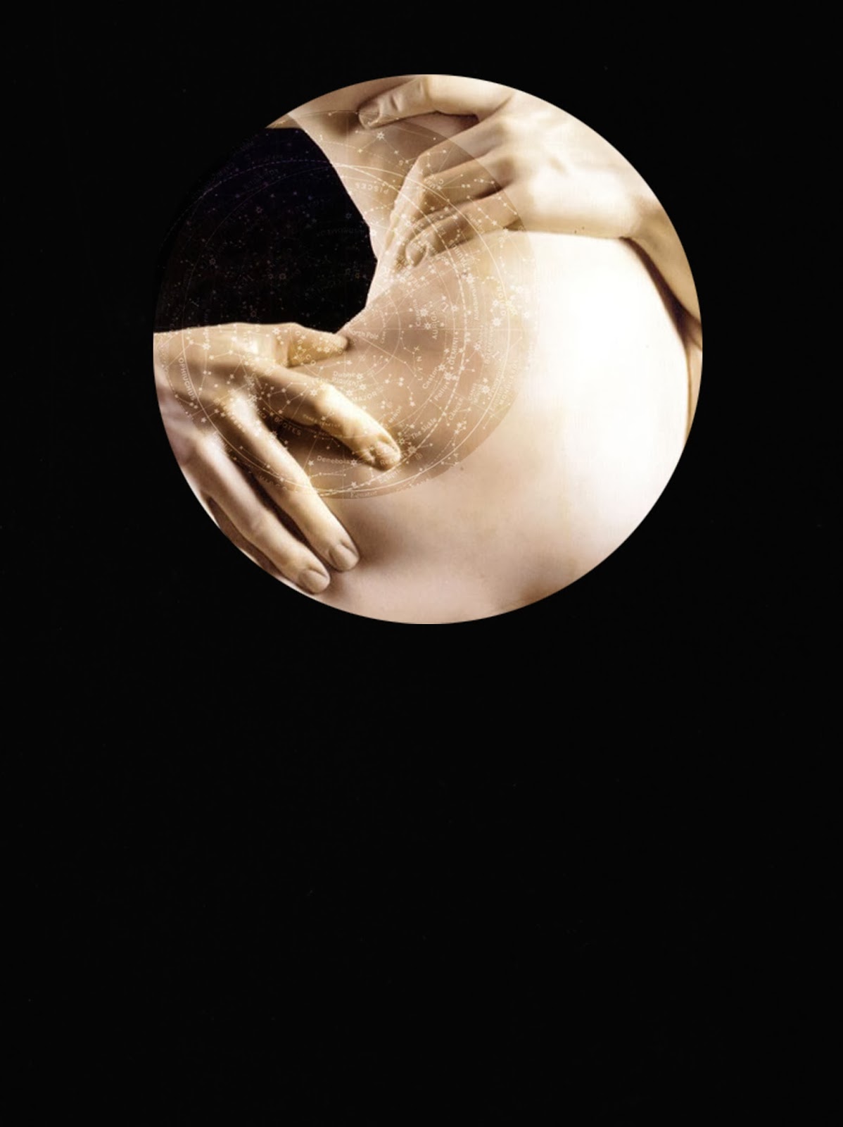
-  Scan in horoscope pages & print
- Pick final for magazine layout & print 
- Pick images for portfolio & print
- Post it notes with analysis/thoughts on print outs 

Remember

- Buy A3 paper to mount work on 
- Buys labels! 

So there is still quite a few things to get on with before Friday but I will be sure to get started on them nice and early tomorrow morning. I also have a one to one crit with Chris that I am looking forward to since I have some points I'd like to discuss in regards to what work to present in my portfolio etc. 

Saturday 23 November 2013

COVER IDEAS - 22.11.2013.


These are two others that I made today in the afternoon. I thought that perhaps the back cover could be a much darker black since it would signify the end of the booklet. I really like how both look on the screen but I'm not too sure how well they will print out, not sure if the black will come out that dark. But I will print these out to see how they go. 

COVER IDEAS - 22.11.2013.

Screen. 
Colour Dodge. 
Lighten. 
Overlay. 
Soft Light. 

Since I'm making a little mock up of my booklet idea I realised that, obviously, it needs a front and back cover. These are some images that I'd made quickly which I thought could look quite nice as cover ideas. I played around with the layer effects for the constellation pattern and I think that it looks like a lovely simple cover idea. I know that I made this up quite quickly since I needed one to add on InDesign but it's growing on me! The effects that work best are soft light, lighten and screen since I think that these would probably print out a lot nicer than colour dodge (even though I really like colour dodge too). But the proof will be in the printing! And also the type of paper I will choose. 

BOOKLET PAGES - 22.11.2013.


Here are the layouts that I made for the booklet idea that I had previously mentioned. I wanted the images to be portrait since it meant that it would be a lot easier to then apply to InDesign. I also scanned in the text from my mock up since it was all in black and white and I wanted to see what it looked like underneath the images. 

I really like how they've turned out since I think they work best with the original black background, although I just altered the contrast a little bit so that you could still make out that the image is within a circle. The text also works so much better by being in black and white since it ties in more with the background.I like the contrast between the 'cut up' aesthetic of the text against the more crisp look of the images.

It's making me think about possibly having two final outcomes for this project, a magazine layout and a booklet, but I will see how this prints out! 

Friday 22 November 2013

BOOKLET IDEA - 22.11.2013.


Ok so this just happened when I felt stuck with my layouts and just didn't know where it was all going. I printed out some of my images and decided I'd make a little booklet with them all. I just thought that what if the horoscopes page didn't exist and instead, magazines came with a booklet version. I know its a step in the opposite direction but a lot of people don't really think that the horoscopes page is very interesting or even illustrated well, although my aim is to make it interesting and well illustrated(!). But by having a booklet that came with it, people might be more interested in reading it since it would sort of turn into something that you could keep. This was just a little idea but my main aim is to create my layouts but ideally if I have time I would like to make a little mock up of this! 

LAYOUT IDEAS - 22.11.2013.


Moving on from my last post I decided to apply my layout idea to all 12 of the signs to see how they all looked. In every horoscope section there is always a 'star sign of the month' which is the illustration that is used, so I obviously wanted to apply each of my images to their own page. Instead of moving each corresponding bit of text under the image in the corner, I kept the layout the same and used my highlighting method in order to link them together. 

I think this works well and I like how your eye is drawn to the image in the corner then straight to the coloured text. I still think this dark background works best for these but that might just be me being stubborn! I just think that my images are quite complex and graphic so to have a background that has anything else going on will be a distraction, along with the text not being legible. It's only a week and a bit till my hand in and I feel I just need to be making direct decisions with my work since I don't have any time to waste.