Showing posts with label Layout. Show all posts

Monday, 12 May 2014

BOOK LAYOUT FINAL / TITLES - 12.05.2014.

Unknown / A Reflection.

The Angel / Lost.

Answers / Forgotten.

Family / Pure.

Dini, Maura / Double Vision. 

Comfort / Healing.

A Holiday / A Mother.

Belongings / Hidden. 

Floating / A Secret.

The Smile / Roma. 

Girl / Questions.

Sanctuary / The Vatican.

Fontana dei Trevi / Wasted Wishes.

Identity / Treviso. 

Sposa / Prayers.

Connected / Unsolved.

Sunday, 4 May 2014

PAGE LAYOUTS / EXPERIMENTS - 4.05.2014.


Here are some more developments for page layout ideas. I scanned in some sections of a couple of scarves that belonged to my Grandmother and placed them alongside the more simple collages. I'm not too sure how I feel about them to be honest. Part of me feels like they work and the other half feels like they don't! Maybe I should try placing them next to my other images or even some of the photographs to see if that works better. 

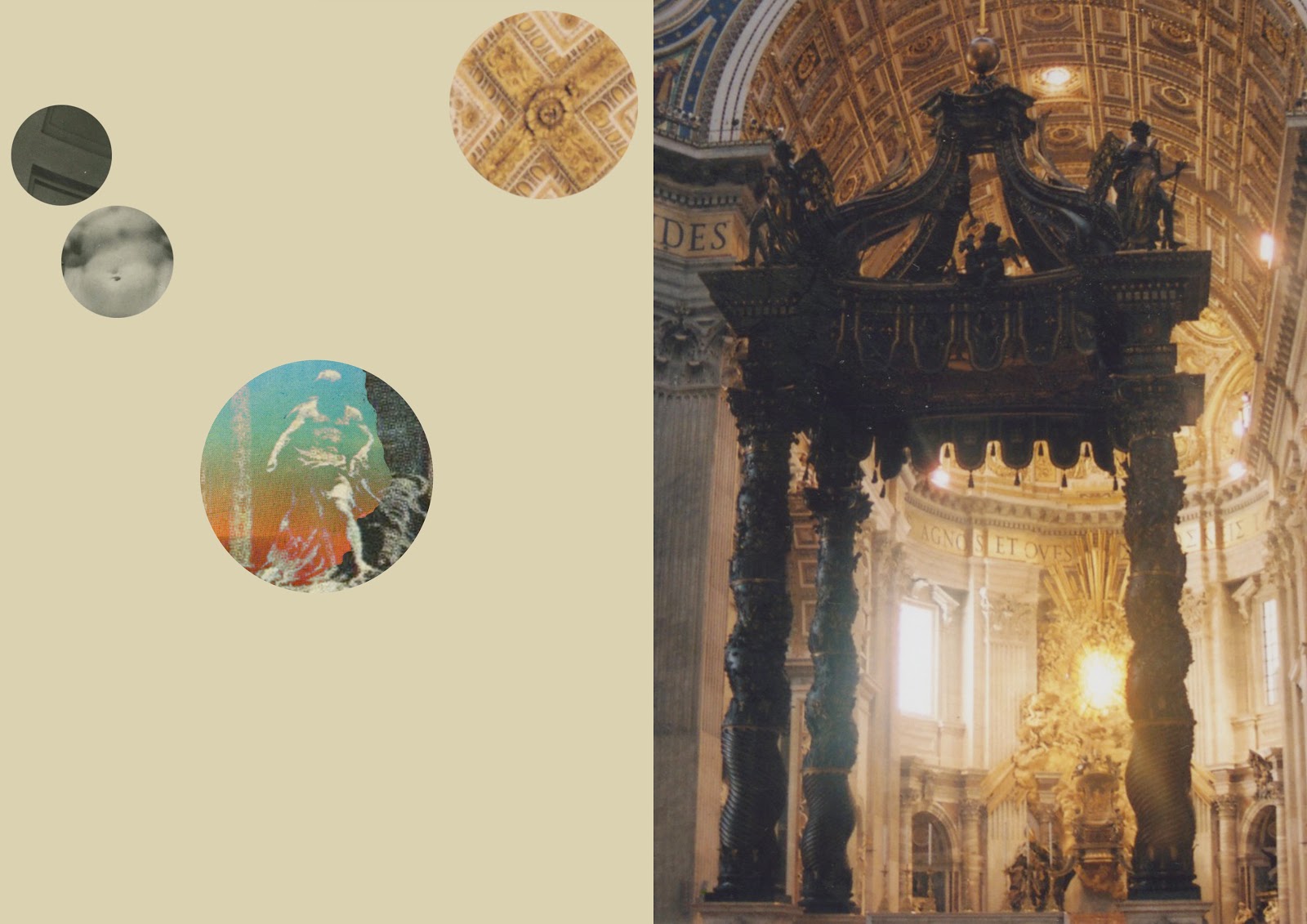
I quite like the third one down where I have put two collages together. I think this could work nicely as a double page spread within a book or even as an A3/A2 print. I started introducing my photos from Italy since I was unsure as to how to use them within this work. I think they work really well when next to my collages or even another photo, as seen with the angel statues. These are all places and monuments that my Grandmother would have visited, spent time in and taken her family to numerous times throughout her life and bind my images together nicely.  

Friday, 22 November 2013

LAYOUT IDEAS - 22.11.2013.


So here are a few other layouts that I tried out this morning. I thought I'd give the cut out text one another try with a darker background and I quite like it! It really makes the image stand out, as well as the text, but I might try and change up the colour of the headers if I can since I don't think I'd want them to necessarily be orange. The next three images are just variations of each other. I decided to type up each bit of text since I found a nice font on dafont.com called Augustus. It's slightly Roman/Greek looking but without being really stereotypical and obvious. One thing that annoyed me though was that I couldn't make the writing justified on Photoshop so it's not all neat like I'd like it to be. It looks fine but I'd still prefer it to be all in line with each other so I will see if I can somehow master that. 

The yellow background on the second image is a bit of a mess really but I just wanted to see what it would look like. I don't particularly like it with a block colour background, it just doesn't seem to sit right with my image and design. It might be because the yellow just doesn't work full stop but I have a feeling that any other colours wouldn't compliment my work. Whereas on the fourth image I feel like it's getting somewhere! I stuck to the dark background, it's actually the same one that I used to build my collages onto, but changed the text to white so then it was legible. The image I used for this one was Aries so instead of making a whole little corner dedicated to it, I thought it would be nice to just highlight the corresponding text to the image. I used the Eyedropper Tool on PS to pick out the pink from the planet and then changed the text to a vibrant pink. I think this works a lot better than just keeping the text plain and it also means that it wold be easy for the reader to quickly find their horoscope, if its the 'star sign of the month'.

Thursday, 21 November 2013

LAYOUT IDEAS - 21.11.2013.


This week has been so busy with finishing up my essay but now that is all done and ring bound for hand in tomorrow, I can concentrate on the rest of my project! I started to play around with layouts for my images to see what worked best and these are just a few that I had tried out. 

I just picked out the Aquarius sign I made and worked around that. With the top two images I just cut out the text from a horoscope page that I had scanned in previously just so I could create a layout quicker than typing it all out. I think that layout I've chosen to do is the easiest way to fit all of the text onto the page clearly but I might try and make it a double page spread since that could be a new way to present the horoscopes. I quite like having the different backgrounds on them but I don't think I have found the right ones since I don't feel 100% sure on those. But then again they are just quick layouts to get my brain thinking. 

The third one is one that I just had the plain white background on, again, with the cut out text. I actually really like it with the white background since it's usually what they opt for in magazines. I think because my images are quite crisp and graphic then the stark background compliments them well. I want to try out different colours and maybe the original black background that I built my collages on to see what works best. In regards to the text I like the cut out look of the paper since it's something different than the standard typed out text and adds a nice texture but I will try typing up a few of my own with a different font to see how that works out too. 

Sunday, 17 November 2013

LAYOUT AND COLOUR IDEAS.


Since I've nearly made all of my images I thought that I would play around with colour and layouts to see what worked best. 

I wanted to keep the images within circles since astrology and lot's of old drawings that I've found with my research all revolve around circular grids and obviously the planets. It's also another way to keep my work looking more uniform and together, even though the collages are all different from each other. Usually within magazines they have the 'Star sign of the month' so will only have an illustration relating to that and not all 12 signs. This makes sense since you don't want to bombard the page with lots of imagery so I think when it comes to creating the layout I will be doing much the same thing. 

I played around with the hue and saturation so that they all linked together aesthetically and I like how the third and fourth images down came out. I muted the colours right down for those but I'd like to see if I can make the star and constellation parts a bit brighter so they have more of a sparkle to them. I'm not too keen on the background being that dark so I'll play around with the saturation on that to see if it looks any better lighter or just see what else could work with the images best. I'd like to see what textured backgrounds look like or even blocks of colour too.