Thursday 15 May 2014

REFLECTION - 15.05.2014.

So I currently have one week till my final hand-in for BA8! I feel happy with how everything is turning out and quite calm which is a first. My portfolio is all ready and in order besides missing a contents page which will be printed out either today or tomorrow. I'm also going to the Peartree Bindery today to pick up my book! I'm very excited to see how it's turned out so then it's all ready for next Friday's submission as well as the graduate show. 

All thats left to do now for the 23rd is: 

- Print contents page. 
- Print out blog guide for tutors.
- Print out work I did for Eden + put in research folder.
- Make sure the blog is up to date. 

For Graduate Show: 

- Print out chosen collage for the graduate show + get framed. 
- Design business cards + get printed. 

CONTENTS PAGE IDEAS - 12.05.2014.


Here are a couple of ideas as to what my contents page will look like for my portfolio. I'm still in the middle of playing around with the layout as I might choose to spread it out over two pages instead but we'll see how it goes!

Monday 12 May 2014

BOOK LAYOUT FINAL / TITLES - 12.05.2014.

Unknown / A Reflection.

The Angel / Lost.

Answers / Forgotten.

Family / Pure.

Dini, Maura / Double Vision. 

Comfort / Healing.

A Holiday / A Mother.

Belongings / Hidden. 

Floating / A Secret.

The Smile / Roma. 

Girl / Questions.

Sanctuary / The Vatican.

Fontana dei Trevi / Wasted Wishes.

Identity / Treviso. 

Sposa / Prayers.

Connected / Unsolved.

Sunday 4 May 2014

PAGE LAYOUTS / EXPERIMENTS - 4.05.2014.


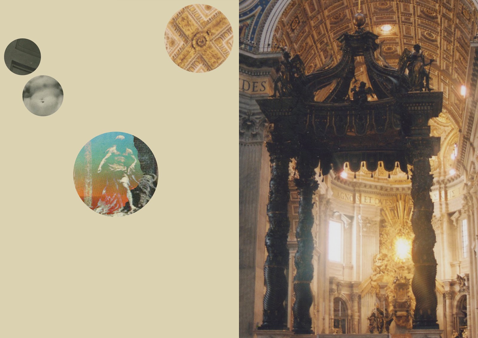
Here are some more developments for page layout ideas. I scanned in some sections of a couple of scarves that belonged to my Grandmother and placed them alongside the more simple collages. I'm not too sure how I feel about them to be honest. Part of me feels like they work and the other half feels like they don't! Maybe I should try placing them next to my other images or even some of the photographs to see if that works better. 

I quite like the third one down where I have put two collages together. I think this could work nicely as a double page spread within a book or even as an A3/A2 print. I started introducing my photos from Italy since I was unsure as to how to use them within this work. I think they work really well when next to my collages or even another photo, as seen with the angel statues. These are all places and monuments that my Grandmother would have visited, spent time in and taken her family to numerous times throughout her life and bind my images together nicely.  

EXPERIMENTS - 4.05.2014.


These are a couple of images that I have been playing around with. You might recognise the second one from my previous post where I had incorporated text into the image as well. I thought these would be nice to have next to some of my more cinematic/powerful collages since I plan to turn this into a book for my exhibition space. I think it would be interesting to have a mixture of full bleed imagery and simple collages like these throughout the book. 

Thursday 1 May 2014

REFLECTION - 1.05.2014.

Today consisted of having a presentation in regards to our exhibition space, portfolio work needed for submission, as well as how to prepare work for a professional portfolio compared to that for hand-in. I really enjoyed the short talk since it cleared up a lot of confusion that I had in regards to what was needed for submission and just put into focus the important dates for this month. 

This morning I decided to go ahead and print out a selection of my images that have made the final cut for the deadline. I still have a few others to print out but I'd like to work on them some more so will do that tomorrow. Having printed out my images to scale has made me think a lot more about the sequence and what images sit well next to each other. I'd also like to print some of the images on glossy paper because I feel like it would strike a nice contrast against the matte parchment paper. Below I am going to type up some things that I would like to get started and maybe finished tomorrow. 

Checklist:

- Print more blurry images onto glossy paper. 
- Scan in silk scarves + edit. Print out to sit next to other images. 
- Think of titles for each photograph. 
- Play around with type as full page spreads.

DEGREE SHOW PROPOSAL FORM - 1.05.2014.

DEGREE SHOW PROPOSAL FORM

PART 1: YOUR WORK

Please note: We are not asking you to identify a specific space. We do want you to be specific about the type of space that would be appropriate for your work i.e. is your work a book, do you need wall space, hanging space or projection / digital

1. Name: Chiara Mottironi            

2. Please give a brief description of the work you intend to exhibit.

The work I intend to exhibit in the Degree Show will consist of one book and 2, quite big, rectangular prints.


3. Please give a brief description of the materials, processes and physical nature of the work i.e. bookwork, film, large prints, screen prints etc. State whether it involves sound, light, projection, requires mains electricity etc.
Hanging requirements, or shelving.
Type here (maximum 100 words)

- Large prints X 2.
- One book (floating shelf needed).
- Smaller floating shelf to fit business cards.
- Space to keep portfolio of work for people to view.


4. Please state how many images or artefacts?

- Prints X 2.
- One book.
- One portfolio.
- Business cards.


Please attach the visual plan of your imagined degree space; incorporating a grid design that shows the arrangement of your work. The visuals in your panels must be to scale, considering how the images will be attached / fitted.

1st Draft Deadline  – Friday 2nd May

Here is a copy of my ideas for the Degree Show. This is just so my tutors can get an understanding of what space will suit my work best and also what work will sit next to each other nicely. As well as taking into consideration the amount of work being displayed, hanging requirements and materials.