Monday, 21 October 2013

HISTORY OF THE ZODIAC.


I've been reading into the history of zodiacs and star signs and found this article written by Kristin O'Donnell Tubb. I've taken the main points that I found interesting and that I think would be good to refer to:

  • Astrology is the theory that the position of the stars and planets has an affect on our daily lives. Because of that, our birthdate determines quite a bit of our personality. Because of that, the waltz these celestial bodies dance across the heavens provides us with both opportunities and obstacles.
  • Most folks who know about these things agree that the Babylonians were the first to develop this idea, some say as far back as 2500 B.C. Like most humans, they were likely trying to make sense of the world around them, to find order in the chaos. Like most humans, they looked up to do that.
  • The idea took. The Babylonian zodiac calendar, which originally had 13+ horoscopes signs (see below), seeped into other cultures. Egyptians adopted the idea. Egyptian decans were star clocks of sorts, depicting 36 constellations that rose and fell, each marking a new phase. Decans were associated with diseases and healings, and each new phase held positives and negatives for health. They have been traced as far back as 2100 B.C., appearing on coffins from around that time. 
  • Indian cultures welcomed these theories, too. Hindu nakshatras divide the ecliptic into 27 or 28 sectors. Each sector is governed by a lord who is fated with forecasting the life path of individuals within that sector. Hindu astrologers believe that children should be given names that please their nakshatra. These calendars started appearing around the beginning of the last millennium B.C. The Chinese zodiac is based on the lunar calendar and appoints one of twelve animals to guide the children of that year. Pottery crafted in China depicts the Chinese zodiac as early as 475 B.C. 


MONICA RAMOS.


These are some illustrations by artist Monica Ramos, although these aren't horoscope related she has done a lot of work for publications such as Rookie Mag, The Lucky Peach, The New York Times and lots more. I thought her work was so beautiful in its simplicity and use of delicate watercolours but what drew me to it was how she applied it to articles. 

A lot of the time her work went alongside photography and her imagery was placed in the corners of the spread, as seen in the second photo for the 'Meat Maids' article. I thought that this wouldn't work since it's a very small space but it's a nice contrast to the photograph in terms of mixed media. In the 6th photo she illustrated an article for The New York Times and I thought this was a great way to see that sometimes simple, clear illustrations can work best alongside a lot of writing. I think that if her drawing had been in colour or had more detail it might have been too overwhelming. Her work has made me think about how to use colour and the scale of imagery too. 

HOROSCOPE RESEARCH.

Bazaar Magazine.
Vogue Girl Korea. 

I've been enjoying looking at lots of horoscope articles since it's nice to see the variety of illustrations that are used to accompany the writing and these are a few more that I have come across which I wanted to share. 

Bazaar: 

I looked at Bazaar Magazine and found this particular article which instead of using illustration they used jewellery, I thought this was a clever way to represent the 'scorpio sign'. Obviously the bracelet directly represents the star sign since its literally a scorpion but I'd never seen actual objects being used for horoscopes before. Although on the other hand it is extremely obvious and visually isn't exciting due to the colour being non existent and the use of type makes it look old and dated. 

Vogue Girl Korea: 

I found this horoscopes article from Vogue Girl Korea and thought it was great! The illustrations are beautiful although I don't know which sign they correspond too, if any at all. What I think works about this though is the layout, use of colour and type. The pink from the dresses links with the star sign titles but also the confetti that goes over the page. The type used for the horoscopes title keeps the page looking fun and girly which ties in with the audience of the magazine, Vogue Girl is aimed at younger teens and this keeps it age appropriate. 

HOROSCOPE RESEARCH.

Marie Claire.

Marie Claire. 

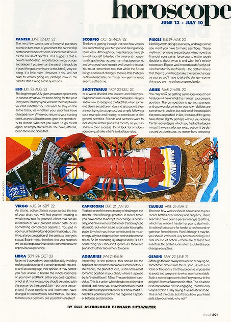
Elle. 

These are a few horoscope articles that I have found whilst doing some research. I've found that whilst looking at horoscope pages within magazines there are a very, very small amount that I find visually interesting. The top two that I found are from Marie Claire Magazine Spain, I like the layout of the article itself since it's clear and easy to read plus the star sign of the month is highlighted in a different colour which I think works well. In regards to the imagery used I do like it but to an extent. The colours and the drawings themselves I think are beautiful and highlight the corresponding star sign effectively but personally I find them too stereotypical i.e. you know that the pisces sign is a fish and so a drawing of fish is used. The same can be said from the third article from Elle Magazine, the image creates a relaxing/holiday atmosphere, somewhere which horoscopes are always read, but I don't think it relates to star signs at all. These type of images are what make me want to create work that is visually exciting as well as something that isn't necessarily viewed as the "typical" horoscope illustrations used today. 

Wednesday, 16 October 2013

BA7 PROPOSAL FINAL.

So after my crit with Chris on Monday I've had a lot of food for thought in regards to my BA7 project and so I've re-written my brief so it is now all done, all finalised!

1. Project proposal title: 

Horoscopes.

2. Project proposal content:  

I plan on working from the horoscope pages that are found within fashion magazines to then create new, interesting and appropriate illustrations that go alongside the writings. I feel like the illustrations that are being currently used for this section, if any at all, aren't visually exciting or appealing. I think that the illustrations for the horoscopes can be more aesthetically interesting and not just standard commercial designs. I want to look at the history of horoscopes and constellations to create work that links with the old, slightly magical, view of start signs. I want to show that illustrations that might be more abstract or surreal can work in this section and that also compliments the text.

3. Context and audience: 

I think that the main audience would obviously be readers that are interested in reading horoscopes that can be found in magazines like Vogue, Elle, Marie Claire etc so I imagine that the ages will range from about 16 right up to more mature women. Fashion magazines can draw a variety of age groups since they offer a range of articles whether its beauty, fashion, travel or food so they have something for everyone. I'd like to use this project to explore creating work that isn't for fictional writing, as much as I enjoy illustrating fictional stories, I'd like to see how my illustrations can be applied to non-fictional work. This will also be a good way to really focus on one solid idea rather than messing about with lots of little ideas, creating small bits of work and then not really knowing what to do with them all, instead this means that I have a more concrete foundation to start with. 

4. Research resources: 

In regards to how I will research into my subject I will start looking at various artists that already do illustrations for fashion magazines or have done in the past. I want to see what illustrations have been used previously but also current ones then I can get a better idea of which magazines horoscope section I'd like to produce work for. I also plan on making good use of the university library due to the huge book selection we have, and I also have some books at home that will help with this topic. I've already begun looking at various artists work that illustrate the horoscope pages to get some ideas of how I can push my work in terms of trying new textures, materials and compositions. 

5. Learning methodology: 

The majority of my ideas and imagery will be generated from the books that I find and start to create images for as this will be my main starting point since it's what will help me to get things moving. Alongside this there will be lots of artist research relating to collage and paper art since I know that collage is definitely my preferred, and visually strongest method of working. This is to give me a deeper and wider knowledge of other ways of working with images that I can take into account to then explore and apply to my own style. I feel that this way of creating illustrations is the easiest way for me to get my ideas across but I don't hesitate to mix medias if I feel it is appropriate. 

6. Work for assessment: 

I have found that it has taken me a very long time to find my right way of working, I seem to work best by just diving straight in with my research then once that's there I can go crazy with the image making and just keep creating visual work. Sometimes I can do my visual alongside my research but it really depends on what I am looking at, either way I will be sure to cut, arrange and glue my thoughts down.  I want to show that the horoscope section can benefit from fresh imagery and not just something that's stereotypical and still be commercially viable. I think from the project I will have learnt how to adapt my work to fit various 'stories' whether from life or from someone's head, this will help to boost my confidence in that I don't have to just stick to the 'story book  route' of illustration and it can be applied to areas I am very passionate about. I hope to hand in a body of work that will be concise, clear and shows how I've adapted my work to fit into my area of interest. 


REFLECTION - 15.10.2013.


Today me and Jane concentrated on bringing all of our text and images together to create our modern broadside (poster). It was quite a long and slow process since we had decided that the best way to go about it was by scanning everything in then arranging it all out on Photoshop, this is all worked out great but what did slow us down was making sure that all the type and images were at a good resolution since we wanted the poster to be A3 in size.

I felt that me and Jane worked really well together in making decisions regarding placement, size and colour. We wanted our poster to have a slightly organic/scrapbook feel since it just shows snippets of our converstion with main points that stood out to each of us. I think that the mixture of my collaged images balance out Jane's hand rendered type really well, the colours compliement each other so nothing is too overpowering which I like. Jane had also brought in some lovely paisley prints which tied in with her work so we chose one of them to use for the background of our poster since using a block colour made it look very unfinished and bare. Instead the paisley print ties in with the textile and fashion industry from both our projects. 

In terms of the type we thought it worked best with a mix of just the type and some with the original boxes left round them. Initially we didn't have the over sized type in the background but the poster looked like it was still missing something and after seeing it didn't need anymore images we played with the text's scale more. It really helped to tie everything in together more but keeping it subtle, especially with the colours Jane used for the type. I'm really pleased with how this turned out since we had a difficult time putting it all together and trying to remember our Photoshop knowledge! I feel our final outcome reflects the flow of our discussion, we want the audience to view it and see snippets of what we spoke about. This is because our chosen topic for the conversation might not be to everyone's taste, maybe even boring(!), which is why we chose to have small quotes rather than anything to long winded that wouldn't hold peoples attention. 


REFLECTION - 14.10.2013.


 Today's has been quite productive! Me and Jane carried on with our project, with me concentrating on collage making and Jane focused on type. It was quite hard to get started, like it is every Monday, but we cracked on and I feel like we have made some progress! I'm pleased with the collages that I made today, especially where I combined line work and also more abstract shapes. We placed some of my images next to Jane's typography and they complimented each other well so now it's just a matter of scanning everything in and playing around with compositions and layout, this will help us to see what gaps need filling in with more text, collage, colour or patterns. 

I also had my first crit of the year with Chris! I'm pleased that I had the talk since I realised that I am still confused as to what to channel my ideas down when it comes to choosing an article. Some of the points that he suggested were: 
  • What article(s) are you going to illustrate?
  • Why?
  • Will the text inform your work?
  • What medias will you be using? 
These questions helped me to think about what I need to focus on and to also rethink/tweak my proposal. During the crit the horoscopes page from magazines was mentioned since it's what started my interest in illustration due to how beautifully decorated they used to be. Chris mentioned that I can choose to illustrate this section of a magazine but to just consider the points and to say why I've chosen this particular article. 
  • Is it due to the current illustrations not working alongside the text? 
  • What will I do to change this? 
  • If its due to aesthetic reasons, why don't I like them? 

Lot's of good points were brought up and I feel like the horoscopes page may be the right path for me since it's something I've always enjoyed reading (and still do) but I feel it lacks imagination and good designs. We briefly touched upon my thoughts for the essay and I got good feedback about all the questions I'd brought up relating to collage although Chris suggested that I filter through them all so that I'm more focused on 1 or 2 ideas rather than lots of little ones. 

My brain is scrambled after today but I thought I'd write a small list of things that I need to do: 

- Rewrite the BA7 brief so I mention what article I will be focusing on (horoscopes) 
- Write 50 words on what to base essay on. 
- Dive into my research!